
Space Glyph issue in Lohit Kannada Font
Jan 15, 2010
1 minute read.
kannada
fonts
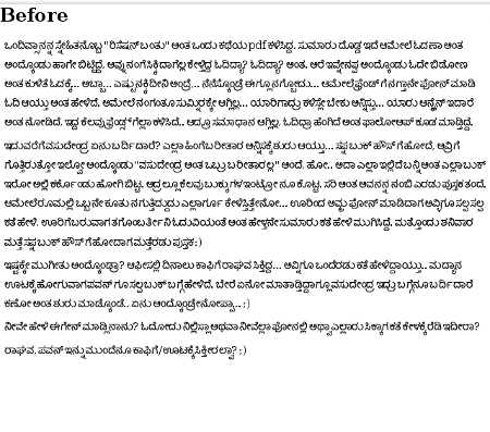
Lohit Kannada is one of the good fonts available for Kannada. But the “space” glyph has very less width, results in less space between the words.
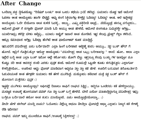
This will have high impact on readability. I increased the width of “space” glyph from 128 to 540 using Fontforge and regenerated the ttf font, now it looks better.
Anybody facing similar issue?
[Update 2010-03-25 20:30:35]
Issue is fixed in latest Lohit Kannada font, check here
About Aravinda VK
Partner at Kadalu Investments, Creator of Sanka, Creator of Chitra, GlusterFS core team member, Maintainer of Kadalu Storage